Learning Analytics Pipeline: From Student Activity to Dashboards
This project showcases a full end-to-end learning analytics pipeline—from simulating student behavior and streaming real-time data via Kafka, to transforming it with dbt/Snowflake, and visualizing insights in Power BI dashboards.
Project Summary
This project simulates how an EdTech platform handles student learning data—from the moment it’s generated in class, all the way to dashboards for business and teaching teams. It includes steps like real-time data generation, streaming, cleaning, modeling, and visualization. The goal is to build a working data pipeline that helps track and understand student engagement in real time.
Tech Stack
- Python – simulate learning events
- Kafka – stream data in real time
- Snowflake – store and manage data
- dbt – clean and model data
- Power BI – build dashboards
- AWS EC2 – run all components in the cloud
Overview
Here’s an overview of the entire pipeline, from data definition to dashboard.
Each step will be explained in more detail below. 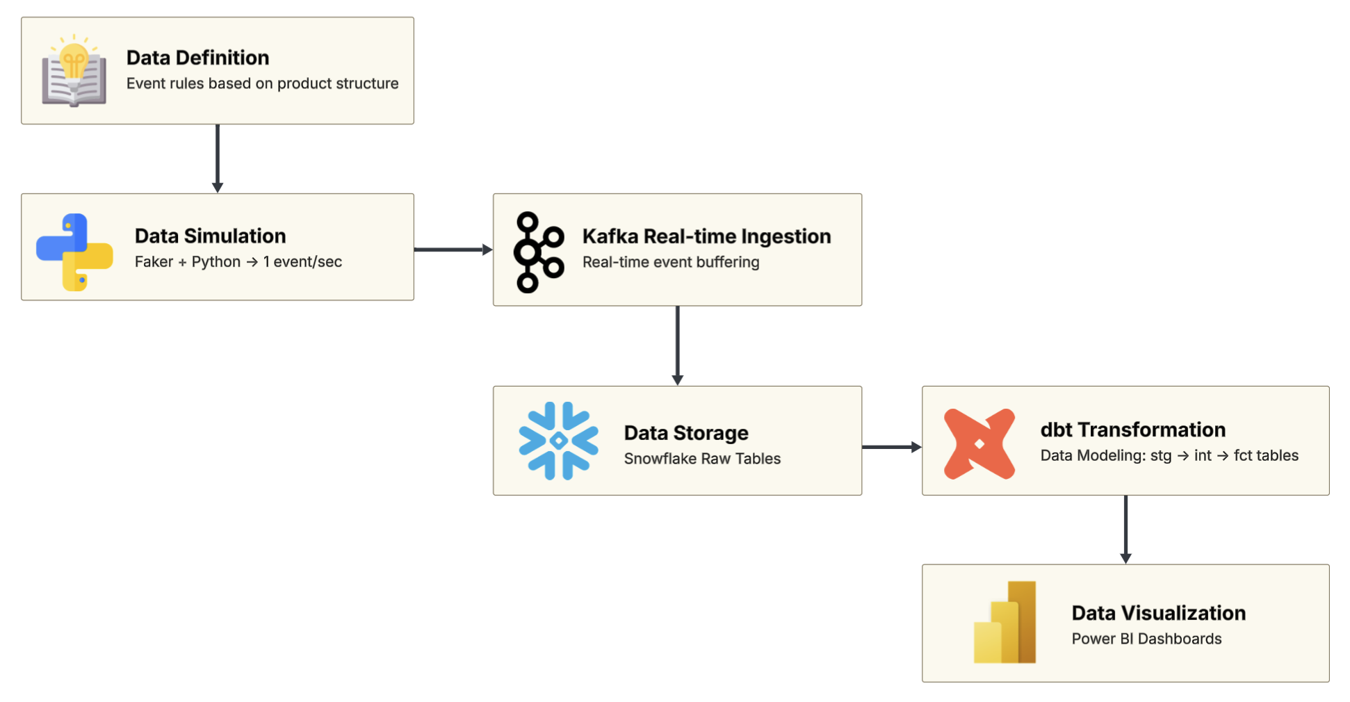
1. Data Definition
Before generating any data, I first defined what student learning behavior would look like.
This is based on the product’s course structure, which breaks down into units, lessons, and different types of learning content. This simple course structure includes two units and three lessons, just enough to demo key content types like video, slide, quiz, and article.
The course structure schema is shown below: 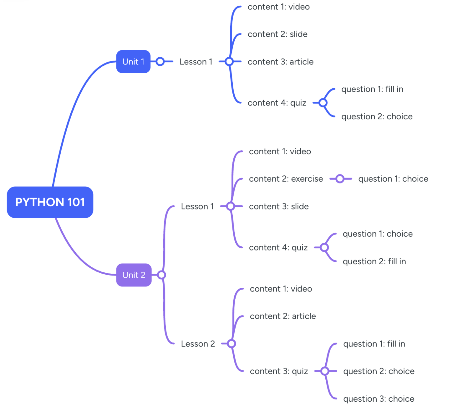
Other definition files—such as the data dictionary, event rules, and event schema—can be found on 👉 GitHub
Here’s a quick overview of the key files:
| File / Module | Description |
|---|---|
| 1. Course Structure Schema | Describes the hierarchy from Course → Unit → Lesson → Content Items. |
| 2. Data Dictionary | Explains each field’s meaning, type, required status, and sample values. |
| 3. Event Definitions | Defines event types, triggers, and granularity—used to simulate realistic student activity. |
| 4. Event Schema (JSON) | A machine-readable schema for generating and processing events in the pipeline. |
Step 2: Data Simulation
After defining the event logic, I used Python and Faker to simulate student learning data in real time.
The script runs on an AWS EC2 instance and generates one event per second, mimicking how students interact with different types of content during a lesson.
Each content type (e.g. video, quiz, article) triggers a different sequence of events.
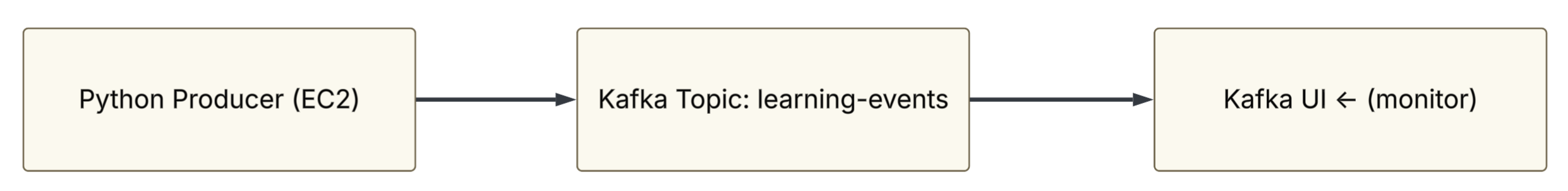
Step 3: Real-time Data Streaming (Kafka)
Kafka is used as the core messaging system to handle real-time learning behavior events. A Python-based producer sends one event per second to the topic learning-events.
Kafka, Zookeeper, and Kafka UI were deployed using Docker on an AWS EC2 instance. Kafka UI was helpful for visually confirming message delivery.
Setup includes:
- Docker-based Kafka, Zookeeper, and Kafka UI
- Topic:
learning-events - Message flow tested with Python producer
Step 4: Load to Snowflake
A Python-based Kafka consumer listens to the topic learning-events and writes each message into a raw table in Snowflake (raw_learning_events_v2).
Each record is stored as a full JSON payload.
The script runs on a separate EC2 instance and connects to Snowflake using the Python connector.
Snowflake ingestion script on GitHub
Step 5: Data Modeling with dbt
The raw events stored in Snowflake are transformed using dbt into clean, analysis-ready tables.
stg_: Standardized staging tables from raw JSONint_: Intermediate logic (e.g. user-level completion)fct_: Final fact tables for reporting and dashboards
dbt Model Flow 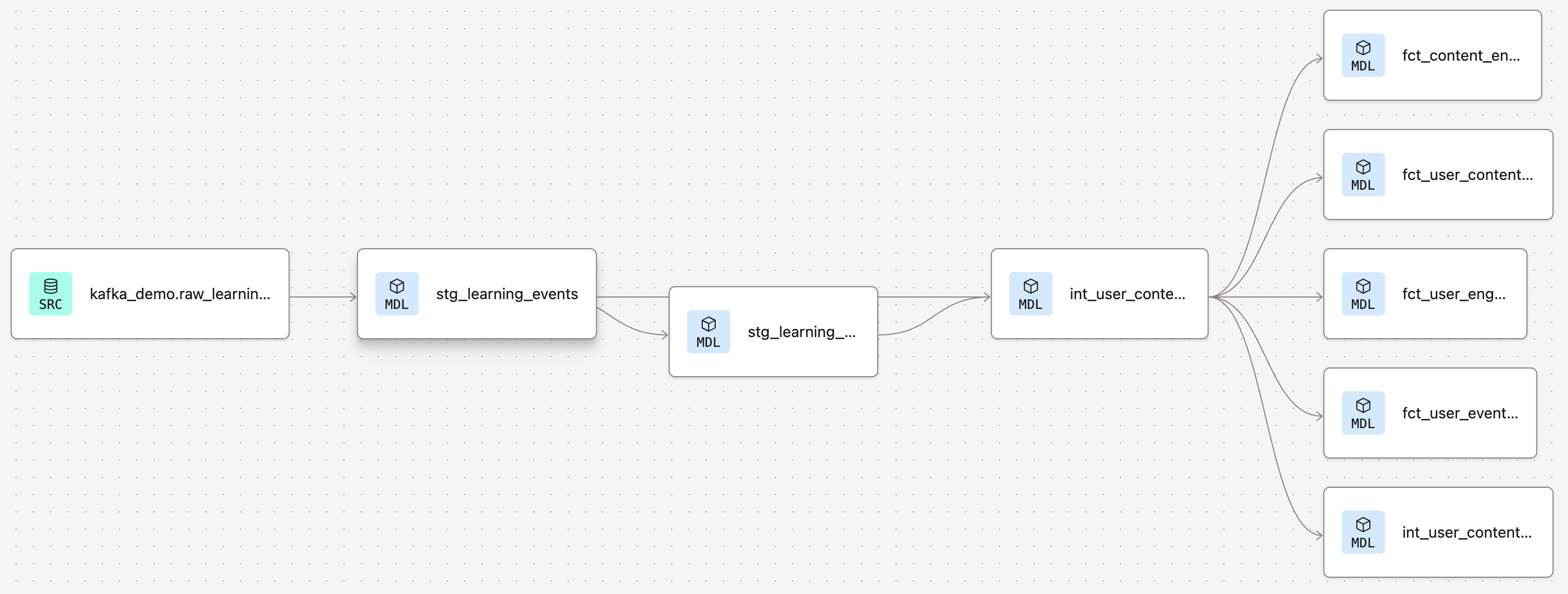
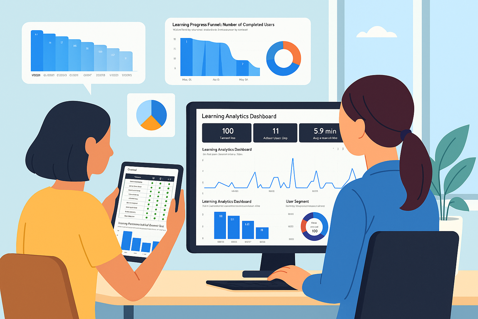
Step 6: Dashboard Design & Visualization
The final step was to visualize the modeled data and turn it into actionable insights.
The dashboards were built in Power BI and designed to meet the needs of different stakeholders—from high-level summaries to in-depth learning behavior analysis.
The overall structure is organized into four pages: 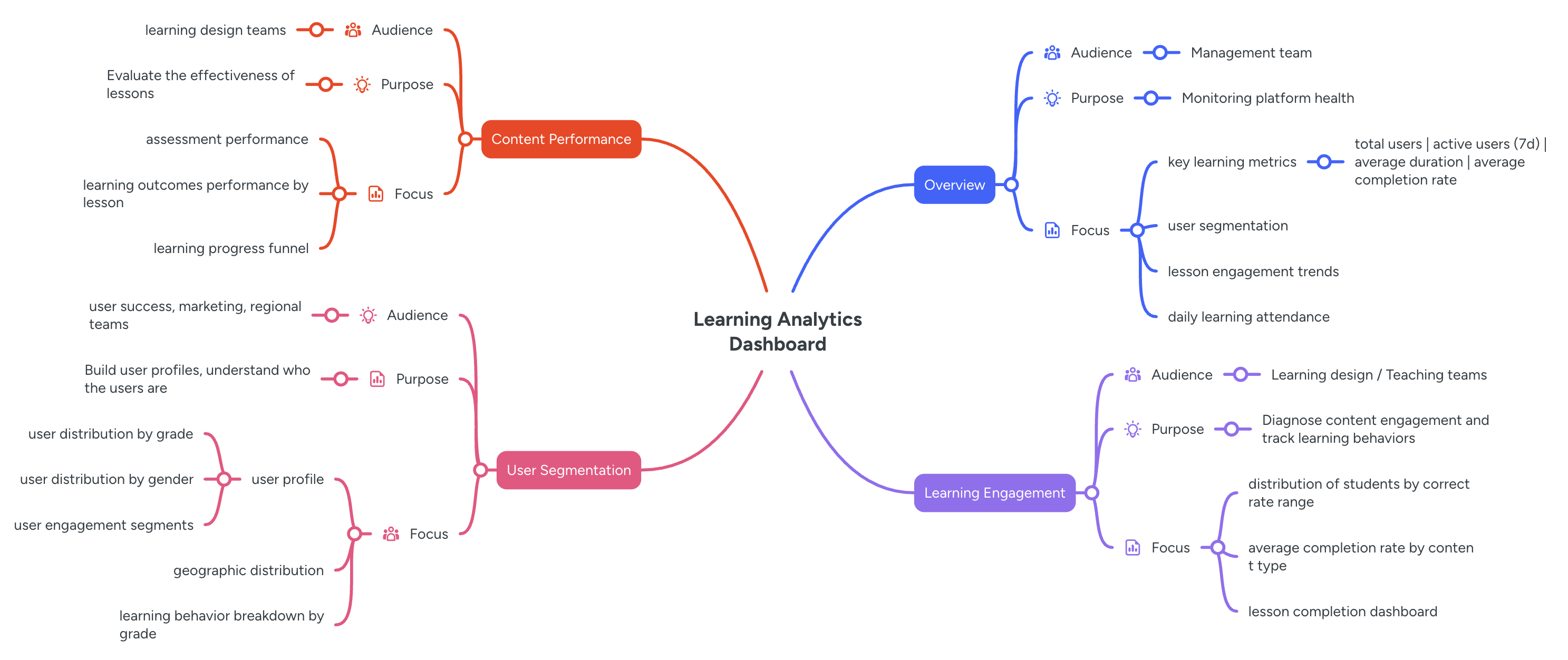
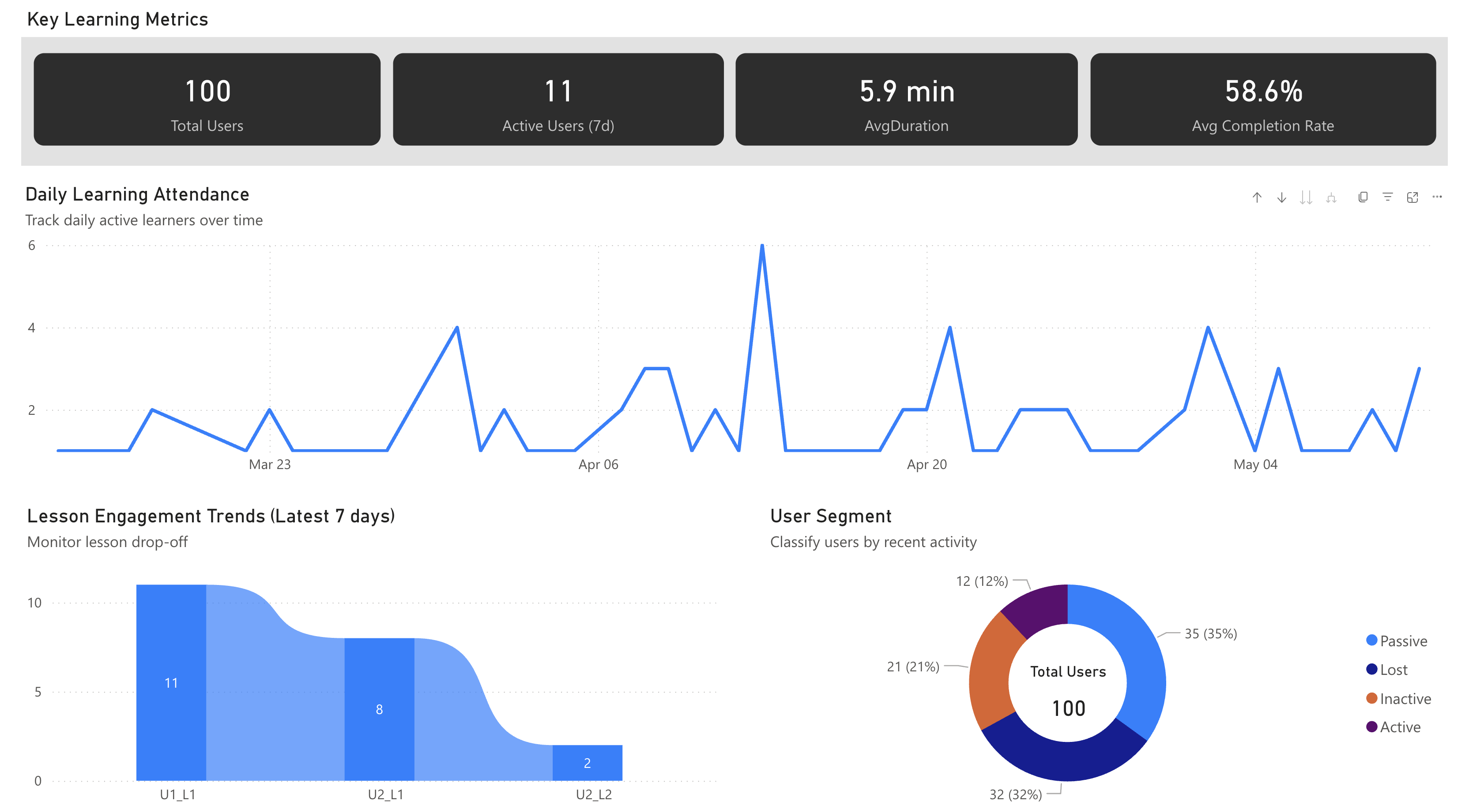
Page1: Overview
- Purpose: Monitor platform usage and learning activity at a glance
- Audience: Executives, product managers
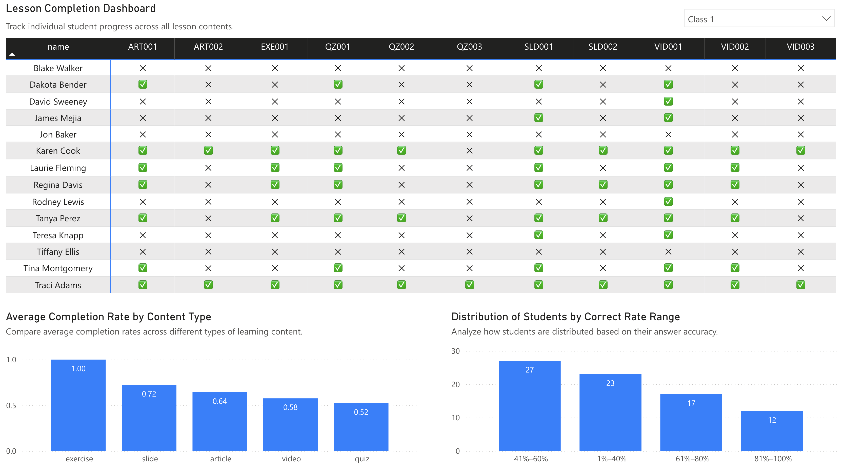
Page2: Learning Engagement
- Purpose: Diagnose how students engage with different content types
- Audience: Instructional designers, learning experience teams
 —
—
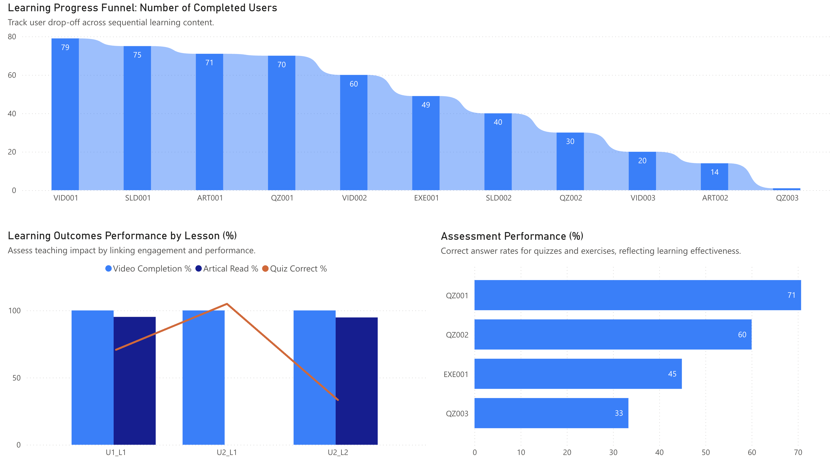
Page3: Content Performance
- Purpose: Evaluate learning effectiveness and content outcomes
- Audience: Curriculum and content development teams
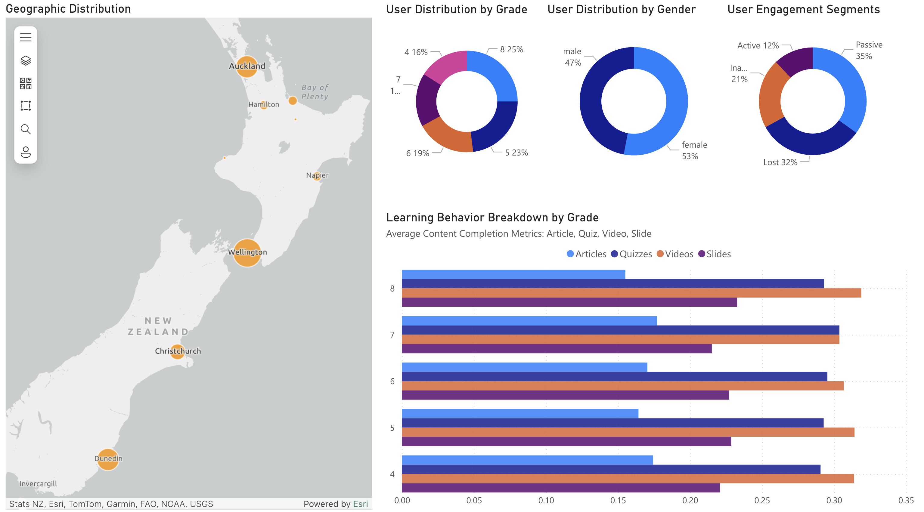
Page4: User Segmentation
- Purpose: Build learner profiles and identify behavior patterns across segments
- Audience: Regional teams, growth/marketing, learner support
Final Thoughts
This project demonstrates a full pipeline of an EdTech analytics process.
The goal was not just to wrangle data, but to turn it into insights that can support decision-making across teams.
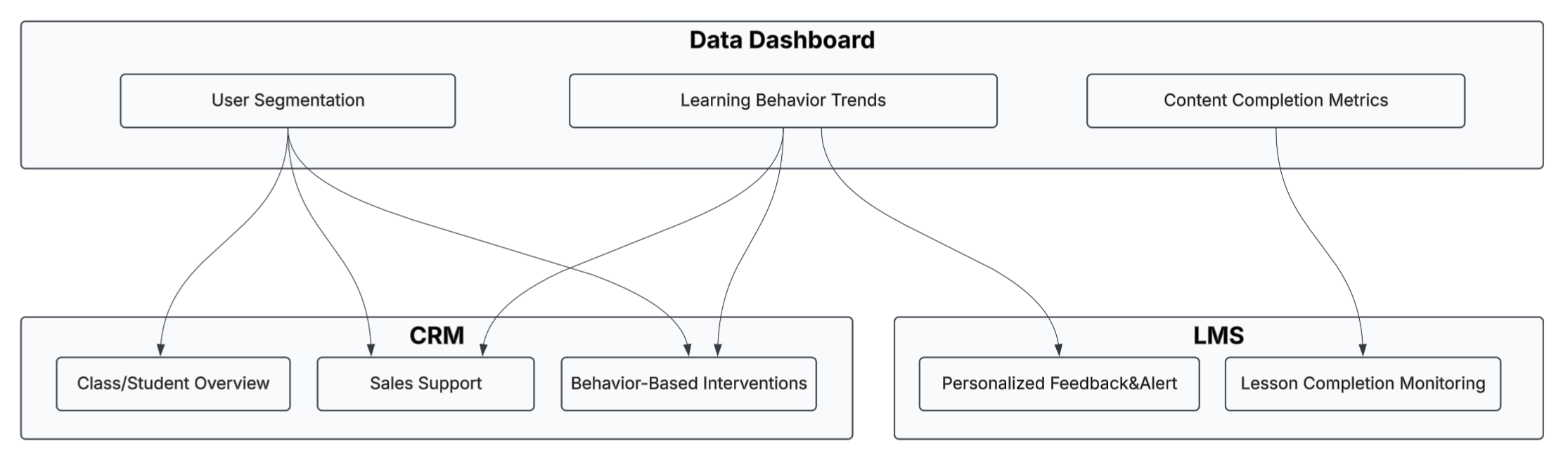
Future Integration: Embedding Dashboards into Real Business Systems
To drive real impact, dashboards can be embedded into the tools that teams already use. For example:
- In a CRM system, course advisors or sales teams can view student learning profiles directly on contact cards, enabling timely support and intervention.
- Within an LMS, teachers can monitor student progress through embedded charts, identify struggling learners, and offer personalized feedback.
Thanks for reading!
Feel free to explore the code and files on GitHub, or reach out if you’d like to collaborate or discuss ideas further.